Table of Contents
What is matplotlib?
Python programming language and its numerical mathematics extension NumPy has its own plotting library called matplotlib. It provides an object-oriented API with which you can embed plots into applications using general-purpose GUI toolkits like Tkinter, wxPython, Qt, or GTK+. John D. Hunter originally wrote Matplotlib, but he died in 2012 at the age of 44. Since then it’s been an active development community maintained by host of others.
As said, “A picture is worth than a thousand words” Python has this visualization library called matplotlib for 2d plotting of arrays. With matplotlib, you can do several plots like line, bar, scatter, histogram, etc.
The matplotlib is a gigantic library and getting the right plot is achieved through trial and error. Generating a basic plot is an easier thing but having a command over the matplotlib library is quite challenging.
This tutorial is for beginner to intermediate level with a mix of theory and examples. We are going to cover:
- pyplot and pylab
- matplotlib’s key concepts
- plt.subplots()
- visualizing arrays with matplotlib
- plotting with pandas and matplotlib
Why matplotlib is confusing:
Even though there is immense documentation on matplotlib library, learning matplotlib is not quite easy due to the following factors:
- As mentioned already, the library itself quite big with large lines of code.
- matplotlib has several interfaces and can be integrated with several different backends. Backend deals with not only how the charts are structured internally but also how it’s getting displayed.
- Even though the documentation is extensive, it’s out of date. The older examples are still floating around with the evolving library.
Let’s learn the core concepts of the design of matplotlib before moving to the examples.
Pylab:
Pyplot is a Matplotlib module with which you can get a MATLAB-like interface. One of the advantages of MATLAB is, it’s globally applicable. Unlike Python, the import is not heavily used in MATLAB. Most of the functions of MATLAB are easily available to users at the top level.
Pylab brings together the classes and functions from matplotlib and NumPy. The people who are familiar with MATLAB can be easily adapted to Pylab as there is not much need for usage of import. By simply adding this one line
from pylab import *
the former MATLAB users can call plot() or array(), as they do in MATLAB.
But Python users know that using import * is bad coding practice as it imports everything into the namespace. As a result, you might end up overwriting Python’s built-ins unnecessarily. And it becomes difficult to find out the bugs. Hence MATLAB advises not to use import * in its tutorials. Instead of import, we need to use %matplotlib to integrate IPython.
Pylab source code actually masks a lot of potentially conflicting imports. For instance, using python –pylab in the terminal or command line, or %pylab actually calls ‘from pylab import *’ under the hood.
Even though matplotlib, explicitly recommends not to use pylab anymore, it still exists. Instead of using pylab we can use pyplot. pyplot makes matplotlib work like MATLAB with its collection of command style functions.
import matplotlib.pyplot as plt
The Hierarchy of matplotlib:
The object hierarchy is one of the main concepts of matplotlib. If you already have gone through some other matplotlib tutorial, you might have came across this line:
plt.plot([1, 2, 3])
It looks like a simple one-line code but the plot is actually a ladder of nested python objects. Under each plot, a structure of matplotlib objects exists.
The Figure object is the top-level container for all plot elements, contains multiple Axes. The axes is different from the axis. The Axes is an object which stores several objects like XAxis, Yaxis and we can create plots by calling its methods.
In the whole picture, Figure is a box-like container that contains multiple axes. In the hierarchy, there are smaller objects like ticks, individual lines, legends, and text boxes exists below the axes. Right from ticks and labels, each element in the chart is a Python object.

The above chart is an example of matplotlib hierarchy. Need not to worry if you are not familiar with this, we are going to cover in our tutorial.
If you don’t have matplotlib installed, then install it using the below command in your tutorial.
pip install matplotlib
Execute the below code:
import matplotlib.pyplot as plt

figure,_=plt.subplots()
print(type(figure))
plt.subplots() returns a tuple containing 2 objects. For now, let’s care only about the first object of the tuple which is Figure object. We can retrieve the first tick of the yaxis of the first axes object by drilling down the hierarchy of the figure.
import matplotlib.pyplot as plt

figure,_=plt.subplots()

# To get first axes of figure
first_axes=figure.axes[0]

# yaxis of first axes object
yaxis=first_axes.yaxis

# first tick of the yaxis of the first axes
first_tick_of_yaxis=yaxis.get_major_ticks()[0]
print(type(first_tick_of_yaxis))
The figure contains a list of Axes. And each Axes have a xaxis and yaxis, each of them has multiple major ticks.
import matplotlib.pyplot as plt

figure,_=plt.subplots()

axes=figure.axes
print(type(axes))
matplotlib calls this as figure anatomy rather than figure hierarchy. You can find the anatomy of figure illustration in the official matplotlib documentation.

Stateful Vs Stateless Approach:
Before moving to the visualizations we need to understand the difference between the state-based or stateful and stateless or object-oriented interface.
We can import the pyplot module from matplotlib and name it as plt by typing the below command.
import matplotlib.pyplot as plt
All functions of pyplot, for example plt.plot() refers to the existing figure and axes. If there is no existing figures and axes, it creates a new one. As mentioned in the matplotlib documentation, “[With pyplot], simple functions are used to add plot elements (lines, images, text, etc.) to the current axes in the current figure”.
Difference between stateful and stateless Interface:
Ex-MATLAB users say this as “plt.plot() is a state-based/state-machine interface, that tracks the current figure implicitly.
- plt.plot() and other functions of pyplot at the top level makes stateful interface calls. Since plt.plot() refers to the current figure and axes, at any given time you can manipulate only one figure and axes. We don’t even need to refer to it explicitly.
- In an Object-oriented approach, we do the above operations explicitly and we take the object references into variables and can directly modify the underlying objects by calling the methods of an Axes object. An Axes object represents the plot itself.
This is an example of a stateful interface:
plt.plot()
We are getting the current Axes object. gca() is a function here not a method:
ax=plt.gca()
In pyplot, most of the functions also exist as methods of matplotlib.axes.Axes class. Calling the gca method on the current figure:
gcf().gca(**kwargs)
# matplotlib/pyplot.py
>>> def plot(*args, **kwargs):
...     ax = plt.gca()
...     return ax.plot(*args, **kwargs)

>>> def gca(**kwargs):
...     """This returns current axes of the current figure."""
...     return plt.gcf().gca(**kwargs)
plt.plot() returns the current axes of the current figure. The stateful interface implicitly tracks the plot it wants to reference.
In the object-oriented approach, there are corresponding getters and setters methods.
Examples: ax.set_title(), ax.get_title()
Calling plt.title() and gca().set_title() does the samething. This is what its doing:
- gca() returns the current axes
- The setter method set_title() sets the title for the current axes. Here we are not explicitly mentioning any axes object.
Similarly all the top-level functions plt.grid(), plt.ylabels(), plt.legend(), etc., follows the same structure of assigning the current axes with gca() and calls the method of current axes.
plt.subplots():
When the graph becomes complex, the object-oriented approach is handy. Let’s do some plotting to understand these concepts.
With plt.subplots(), in object-oriented we can create a Figure with single Axes. This is the only place we create a Figure and Axes with an object-oriented approach.
figure,axes=plt.subplots()
The plt.sublpots() returns a single figure and single AxesSubplot object.
>>> type(figure)
<class 'matplotlib.figure.Figure'>
>>> type(axes)
<class 'matplotlib.axes._subplots.AxesSubplot'>
While calling plt.subplots() we are not calling any arguments. The default arguments are nrows=1 and ncols=1.
Since we have the AxesSubplot object, we can call its methods similar to the way we call the functions of the pyplot.
Stacked area graph:
Let’s see an example of a stacked area graph of three-time series.
Install the numpy by typing the below command in your terminal.
pip install numpy
The below code generates the graph:
import matplotlib.pyplot as plt
import numpy as np

range=np.arange(50)
rnd=np.random.randint(0,10,size=(3,range.size))
years=1950+range
figure,axes=plt.subplots(figsize=(5,3))
axes.stackplot(years, range + rnd, labels=['Eastasia', 'Eurasia', 'Oceania'])
axes.set_title('Combined debt growth over time')
axes.legend(loc='upper left')
axes.set_ylabel('Total debt')
axes.set_xlim(xmin=years[0],xmax=years[-1])
figure.tight_layout()

plt.show()
Here’s the explanation for the above code:
- np.arange(50): creates a 1d array of length 50 with numbers ranging from 1 to 50
- random.randint(): The function returns an array of specified shape and fills with random numbers ranging from low to high. The highest limit is exclusive. In our case, the lowest limit is 0, the highest limit is 10, and the size is (3, range.size). The output will be a 2d array of size 3*50, filled with numbers from 0 to 10(not inclusive).
- We can specify the figure’s width and height in the unit “inches” with the figsize attribute, .
- stackplot(): It displays each part loaded onto one another and how each part contributes in making a complete figure. It displays various sections of data and it acts like a pie chart. It has x-label, y-label, and title in which we can represent various parts with different colors.
- set_title(): As the name indicates, this setter method sets the title.
- legend(): Area that describes the elements of the graph.
- set_ylabel: Seys the label for the y-axis.
- set_xlim: Sets the limit for x-axis.
- tight_layout: In order to give the specified padding, it automatically adjusts the parameters of the subplot.
- show: Shows the graph.
Here we are saving the Axes object to the variable axes. By directly calling the methods of axes, we are creating a stacked area chart, setting title, adding a legend, and setting the label of the y-axis. This is an example of an object-oriented approach. This is the output graph:

Scatter plot and Histogram:
Let’s see one more example where a figure contains multiple axes. Here we are going plot two correlated arrays drawn from the discrete uniform distribution.
import matplotlib.pyplot as plt
import numpy as np

x = np.random.randint(low=1, high=11, size=50)
y = x + np.random.randint(1, 5, size=x.size)
data = np.column_stack((x, y))
figure, (axes1, axes2) = plt.subplots(nrows=1, ncols=2,figsize=(8, 4))
axes1.scatter(x=x, y=y, marker='o', c='r', edgecolor='b')
axes1.set_title('Scatter: x versus y')
axes1.set_xlabel('x')
axes1.set_ylabel('y')
axes2.hist(data, bins=np.arange(data.min(), data.max()),label=('x', 'y'))
axes2.legend(loc=(0.65, 0.8))
axes2.set_title('Frequencies of x and y')
axes2.yaxis.tick_right()
plt.show()
The code does the following things:
- Here we are passing the parameters to the subplots() that creates a single figure and two axes subplots.
- The variables x and y are of 1d array filled with random numbers.
- We are handling the axes objects separately. We are creating a scatter plot with one axes object and histogram with other axes object.
- tick_right(): The function shows the points on the coordinated axis on the right side.
With the stateful approach, it’s difficult to handle the two axes objects individually. The output graph will be like:

The marker argument in the scatter function defines the marker style that you can change as per your wish. Here we are changing the marker to ‘s’.
axes1.scatter(x=x, y=y, marker='s', c='r', edgecolor='b')
And by placing text inside the dollar sign changes the text to Italics.
axes1.set_title('$Scatter$: x versus y')
axes2.set_title('$Frequencies$ $of$ x $and$ y')
The output will be like:
As we have seen before, from the figure itself we can get the axes objects.
>>> figure.axes[0] is axes1 and figure.axes[1] is axes2
True
m*n grid of axes objects:
Also, we can create a figure that contains axes objects in the m*n grid. One such example is:
figure,axes=plt.subplots(nrows=2,ncols=2,figsize=(7,7))
If you check the type of axes, its no longer AxesSubplot. Instead, it’s a numpy array.
>>> type(axes)
<class 'numpy.ndarray'>
>>> axes
array([[<matplotlib.axes._subplots.AxesSubplot object at 0x0A4BBAD0>,
        <matplotlib.axes._subplots.AxesSubplot object at 0x0D44F2B0>],
       [<matplotlib.axes._subplots.AxesSubplot object at 0x0D4700F0>,
        <matplotlib.axes._subplots.AxesSubplot object at 0x0D4952D0>]],
      dtype=object)
>>> axes.shape
(2, 2)
The Numpy array is just a container. On each of the Axes objects, we need to call the plotting methods. We can use the flatten method to convert the 2d Numpy array to 4 objects to type AxesSubplot.
axes1,axes2,axes3,axes4=axes.flatten()
>>> type(axes1)
<class 'matplotlib.axes._subplots.AxesSubplot'>
There is an alternative way to do this. But the previous method is flexible.
((axes1,axes2),(axes3,axes4))=axes

>>> type(axes1)
<class 'matplotlib.axes._subplots.AxesSubplot'>
Advanced subplot features:
Let’s understand to understand some advanced features of subplot with an example. Using Python libraries io, urllib, and tarfile we will extract macroeconomic California housing data from a compressed tar archive.
import numpy as np
from io import BytesIO
import tarfile
from urllib.request import urlopen

url='https://www.dcc.fc.up.pt/~ltorgo/Regression/cal_housing.tgz'
bytesio_object=BytesIO(urlopen(url).read())
file_path = 'CaliforniaHousing/cal_housing.data'
with tarfile.open(mode='r', fileobj=bytesio_object) as archive:
    housing = np.loadtxt(archive.extractfile(file_path), delimiter=',')
The url variable is the URL that contains the data. The above code extracts the data from the file and stores it to the numpy array.
Let’s get the value of the average home, the population of the area, and the age of the average house.
>>> avarage_home_value=housing[:,-1]
>>> population,age=housing[:,[4,7]].T
The T attribute is nothing but the transpose of the array.
Let us write one more function that acts like an “in-plot title” by placing a text box inside a plot.
def add_titlebox(axes, text):
    axes.text(.55,.8,text,horizontalalignment='center',
        transform=ax.transAxes,bbox=dict(facecolor='white',alpha=0.6),
        fontsize=12.5)
    return axes
We can customize the subplot with matplotlib’s gridspec module. We can interact with gridspec module with pyplot’s subplot2grid(). This is the layout we are going to create:

Here we have a 3*2 grid. ax1 contributes to twice the height and width of ax2 and ax3.

To the subplot2grid() we are passing (row, column) as an argument which is nothing but the location of the axes object in the grid.
gridsize=(3,2)
figure=plt.figure(figsize=(12,8))
ax1=plt.subplot2grid(gridsize, (0, 0), colspan=2, rowspan=2)
ax2 = plt.subplot2grid(gridsize, (2, 0))
ax3 = plt.subplot2grid(gridsize, (2, 1))
Now we can deal with each of the axes individually.
ax1.set_title("Value of home as a function of age of home and population of area")
scatter=ax1.scatter(x=age,y=population,c=average_home_value,cmap='RdYlGn')
plt.colorbar(scatter,ax=ax1,format='$%d')
ax1.set_yscale('log')
ax2.hist(age,bins='auto')
ax3.hist(population,bins='auto',log=True)

add_titlebox(ax2,'Histogram: Age of the home')
add_titlebox(ax3, 'Histogram: Area population (log scl.)')

plt.show()
The colorbar method adds the colorbar to the plot. It gets called directly on the figure, not on the axes. It takes ax1.scatter() as an argument, which maps the average home value to the ColorMap.

As we move up and down along the y-axis, there is not much differentiation in the color. It indicates that the age of the house plays a stronger role in determining the value of the house.
The Figure:
A figure can be created in two ways:
- Calling plt.subplots()
- Calling plt.figure() creates a figure with no axes. This is not frequently used.
Whenever we can create a new figure, the matplotlib keeps it around in memory. We have seen the concept of the current figure and current axes in a stateful interface. The current figure and current axes are the most recently created ones and we can use the built-in function id() to show the address of the object in memory.
>>> figure1,axes1=plt.subplots()

>>> id(figure1)
162617520
>>> id(plt.gcf())
162617520

>>> figure2,axes2=plt.subplots()

>>> id(figure2)
203096944
#plt.gcf() returns the current figure
>>> id(figure2)==id(plt.gcf())
True
>>>
The most recently created figure is the current figure. Both of these figures are in memory, each accessed with their corresponding ID. As in MATLAB style, the indexing starts with 1.
>>> plt.get_fignums()
[1, 2]
By mapping the plt.figure() to the each of the fignums, we can get the figure.
>>> def get_all_figures():
...     return [plt.figure(i) for i in plt.get_fignums()]

>>> get_all_figures()

[<Figure size 640x480 with 1 Axes>,
 <Figure size 640x480 with 1 Axes>]
When you open a number of files, then to avoid memory error you need to close them. plt.close() closes the current figure, plt.close(‘all’) closes all and plt.close(num) closes the figure number num.
>>> plt.close('all')
>>> get_all_figures()
[]
imshow() and matshow():
The methods imshow() and matshow() are the heavily used methods. matshow() is a wrapper around the imshow(). These are used to visualize a numerical array as a colored grid.
With Numpy let’s create two definite grids.
array1=np.diag(np.arange(2,12))[::-1]
array1[np.diag_indices_from(array1[::-1])] = np.arange(2, 12)
array2 = np.arange(array1.size).reshape(array1.shape)
Now we can represent the array1 and array2 in image format. Using dictionary comprehension we are going to toggle off the ticks and all the axis labels and pass the result to tick_params() method.
sides=('top','bottom','left','right')
nolabels={s: False for s in sides}
nolabels.update({'label%s' %s:False for s in sides})
>>> nolabels
{'top': False, 'bottom': False, 'left': False, 'right': False, 'labeltop': False, 'labelbottom': False,
'labelleft': False, 'labelright': False}Now we are going to disable the grid using context manager and on each axes we are going to call matshow(). Finally, we are going to put colorbar which is technically a new axes within a figure.
from mpl_toolkits.axes_grid1.axes_divider import make_axes_locatable

with plt.rc_context(rc={'axes.grid': False}):
    figure, (axes1, axes2) = plt.subplots(1, 2, figsize=(8, 4))
    axes1.matshow(array1)
    image=axes2.matshow(array2,cmap='RdYlGn_r')
    for axes in (axes1,axes2):
        axes.tick_params(axis='both',which='both',**nolabels)
    for i,j in zip(*array1.nonzero()):
        axes1.text(j,i,array1[i,j],color='white',ha='center',va='center')

    divider=make_axes_locatable(axes2)
    cax=divider.append_axes("right",size='5%',pad=0)
    plt.colorbar(image,cax=cax,ax=[axes1,axes2])
    figure.suptitle('Heatmaps with "Axes matshow"',fontsize=16)

    plt.show()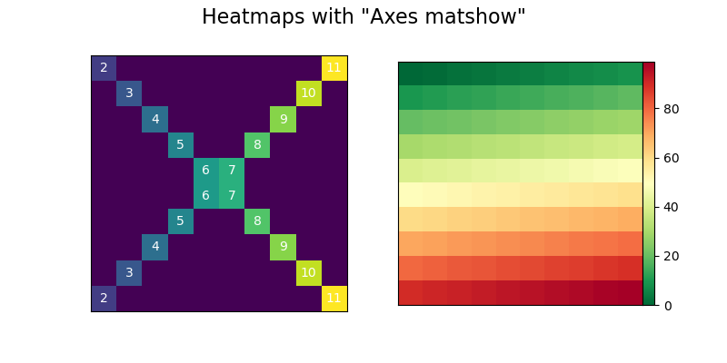
Plotting with Pandas:
Pandas come with its plotting methods. The pandas plotting methods are wrappers around the existing matplotlib calls.
For example, the plot() method which we use Pandas on Series and DataFrame is just a wrapper around plt.plot(). As we know already that plt.plot() implicitly refers to the current figure and axes, Pandas follow just the same. Another example is if the index of the Pandas Dataframe contains the date then, Pandas calls gcf().autofmt_xdate() to retrieve the current figure and it also auto-formats the x-axis.
Let’s understand these concepts with some code examples. First, install pandas using pip.
pip install pandas
import matplotlib.pyplot as plt
import pandas as pd
import numpy as np

series=pd.Series(np.arange(5),index=list('abcde'))
axes=series.plot()
Now we have created an AxesSubplot in Pandas. Check the type to make sure of that.
>>> type(axes)
<class 'matplotlib.axes._subplots.AxesSubplot'>
>>> id(axes)==id(plt.gca())
True
Pandas with matplotlib:
It’s better to understand the internal architecture when mixing the plotting methods of Pandas with matplotlib calls. We are going to see an example where we plot the moving average of a widely watched financial time series. We are going a create a Pandas series and call plot() method on that. Then we are going to customize it by its Axes created by the matplotlib’s plt.gca().
import matplotlib.transforms as mtransforms

url = 'https://fred.stlouisfed.org/graph/fredgraph.csv?id=VIXCLS'
vix = pd.read_csv(url, index_col=0, parse_dates=True, na_values='.',infer_datetime_format=True,squeeze=True).dropna()
mean_average=vix.rolling('90d').mean()
state = pd.cut(mean_average, bins=[-np.inf, 14, 18, 24, np.inf],labels=range(4))
cmap = plt.get_cmap('RdYlGn_r')
mean_average.plot(color='black', linewidth=1.5, marker='', figsize=(8, 4),label='VIX 90d MA')
axes = plt.gca()
axes.set_xlabel('')
axes.set_ylabel('90d moving average: CBOE VIX')
axes.set_title('Volatility Regime State')
axes.grid(False)
axes.legend(loc='upper center')
axes.set_xlim(xmin=mean_average.index[0], xmax=mean_average.index[-1])
trans = mtransforms.blended_transform_factory(axes.transData, axes.transAxes)
for i, color in enumerate(cmap([0.2, 0.4, 0.6, 0.8])):
    axes.fill_between(mean_average.index, 0, 1, where=state==i,facecolor=color, transform=trans)
axes.axhline(vix.mean(), linestyle='dashed', color='xkcd:dark grey',alpha=0.6, label='Full-period mean', marker='')

plt.show()
The explanation of the code:
- Reading the CSV file from the URL mentioned and converting it to the Pandas series, saving into variable vix.
- The rolling() function is primarily used in time-series data. We can do rolling window calculations with rolling() function. In very basic words, we perform the mathematical operations on the window of size n at a time. The size of the window means the number of observations used for calculating the statistic. If the window is of size n means n consecutive values at a time. Here we are performing mean operation on the vix over each window.
- The cut function is used to segment and sort data into buckets.
- We are calling the plot() function and explicitly referring to the current Axes.
- The second block of code creates color-filled blocks that correspond to each bucket of state.cmap([0.2,04,0.6,0.8]) .It means that “For the colors at the 20th, 40th, 60th, and 80th ‘percentile’ along the ColorMaps’ spectrum, get us an RGBA sequence.”To map each RGBA color back to a state enumerate() is used.

Add-on topics:
Configuration and Styling:
In matplotlib, you can configure style across the different plots in a uniform way. There are two ways to do that.
- Customize matplotlibrc file.
- Change the configuration parameters either from a .py script or interactively.
The matplotlibrc file is a text file containing the customized settings of the user and can be remembered between sessions.
We can also change the configuration parameters interactively as mentioned before. Since we have imported matplotlib.pyplot as plt, we can access the rcParams.
>>> [attr for attr in dir(plt) if attr.startswith('rc')]
['rc', 'rcParams', 'rcParamsDefault', 'rcParamsOrig', 'rc_context', 'rcdefaults', 'rcsetup']
The objects starting with ‘rc’ are the means to interact with plot settings and styles.
plt.rcdefaults() replaces the rc parameters to the default values listed at reParamsDefault. This overrides whatever you have customized.
plt.rc() is for interactively setting the parameters.
plt.rcParams() is a dictionary-like object. The customized changes in the matplotlibrc files are reflected here. You can also change this object directly.
# changing rc
plt.rc('lines', linewidth=2, color='g')

#Changing rcParams
plt.rcParams['lines.linewidth'] = 2
plt.rcParams['lines.color'] = 'r'
To view available styles:
>>> plt.style.available
['Solarize_Light2', '_classic_test_patch', 'bmh', 'classic', 'dark_background', 'fast', 'fivethirtyeight', 'ggplot',
 'grayscale', 'seaborn', 'seaborn-bright', 'seaborn-colorblind', 'seaborn-dark', 'seaborn-dark-palette', 'seaborn-darkgrid',
 'seaborn-deep', 'seaborn-muted', 'seaborn-notebook', 'seaborn-paper', 'seaborn-pastel', 'seaborn-poster', 'seaborn-talk',
 'seaborn-ticks', 'seaborn-white', 'seaborn-whitegrid', 'tableau-colorblind10']
To set a style:
plt.style.use('fivethirtyeight')Interactive mode:
As mentioned already matplotlib interacts with different backends. The backend does the major work in rendering a chart. Some of the backends are interactive and indicates the user whenever they are changed.
You can check its status by:
>>> plt.rcParams['interactive']
False
You can also change it on/off:
>>> plt.ion()
>>> plt.rcParams['interactive']
True
>>> plt.ioff()
>>> plt.rcParams['interactive']
False
The usage of this interactive mode is:
- We have used plt.show() to display the chart. We don’t need this function if the interactive mode is on and will be updated as we reference them.
- plt.show() is needed to show the chart if the interactive mode is off, and plt.draw() to update a chart.
An example with interactive mode ‘on’:
plt.ion()
array = np.arange(-4, 5)
array1 = array ** 2
array2 = 10 / (array ** 2 + 1)
figure, axes = plt.subplots()
axes.plot(array, array1, 'rx', array, array2, 'b+', linestyle='solid')
axes.fill_between(array, array1, array2, where=array2>array1, interpolate=True,color='green', alpha=0.3)
legend = axes.legend(['array1', 'array2'], loc='upper center', shadow=True)
legend.get_frame().set_facecolor('#ffb19a')